Guide
Docs
A tour of Raeda: the workspace, adding a component, and what each module works out. Then your account and plan, and every shortcut in the 3D view. All sizes are in inches.
Each build opens in one workspace: a 3D view of your van, with a rail of modules down the left side. Beside the rail sits the panel of whichever module is open. Place a component in the 3D view, and every module that cares about it updates at once.
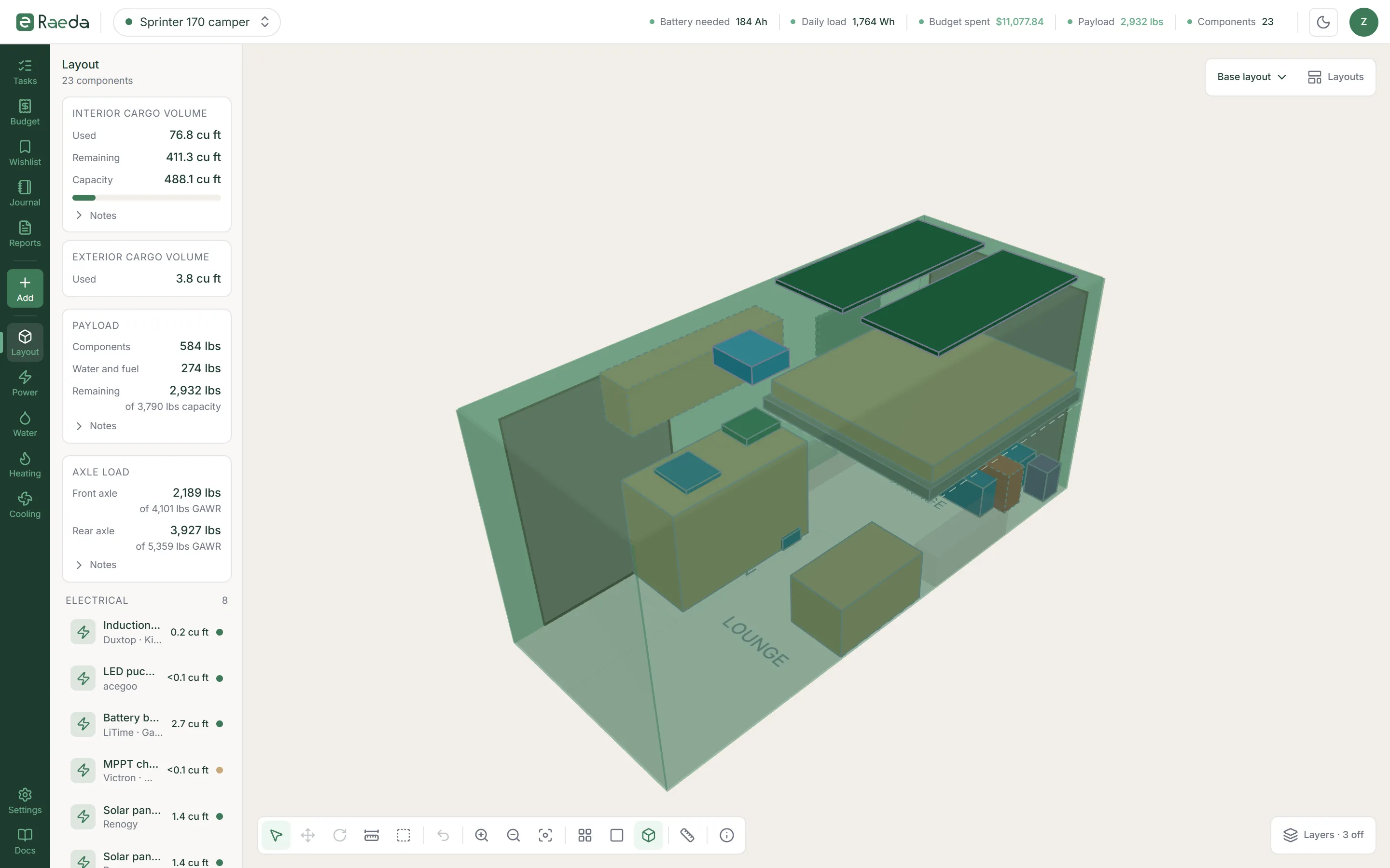
- Top bar
Switch between your builds, and read five live figures that update as you add, change and remove components.
- Battery needed — the battery bank your daily load calls for.
- Daily load — the watt-hours your components draw in a day.
- Budget spent — against your target.
- Payload — what is left of the van’s payload after your components and the water and fuel they hold.
- Components — how many are in the build.
- On the right — the getting-started list while you have steps left, the light and dark theme, and your account menu.


The top bar’s five figures sit between the build switcher and the account menu. - Rail
The dark column on the left. Each icon opens a module’s panel beside it. Click the open one again to close the panel.
- Add — between the planning modules and the build modules, adds a component.
- At the foot — this build’s settings and these docs.
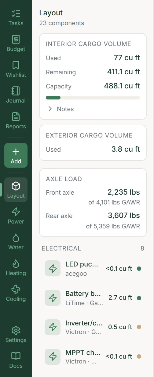
The rail, with Add above the build modules and the settings cog at its foot.
- Build
The cog at the foot of the rail opens this build’s settings, on Build: its name, description and status. Your spend charts and the reports and their exports are in the Reports module on the rail.
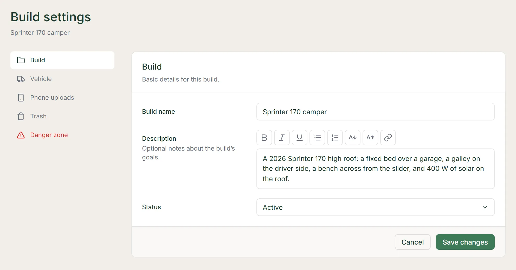
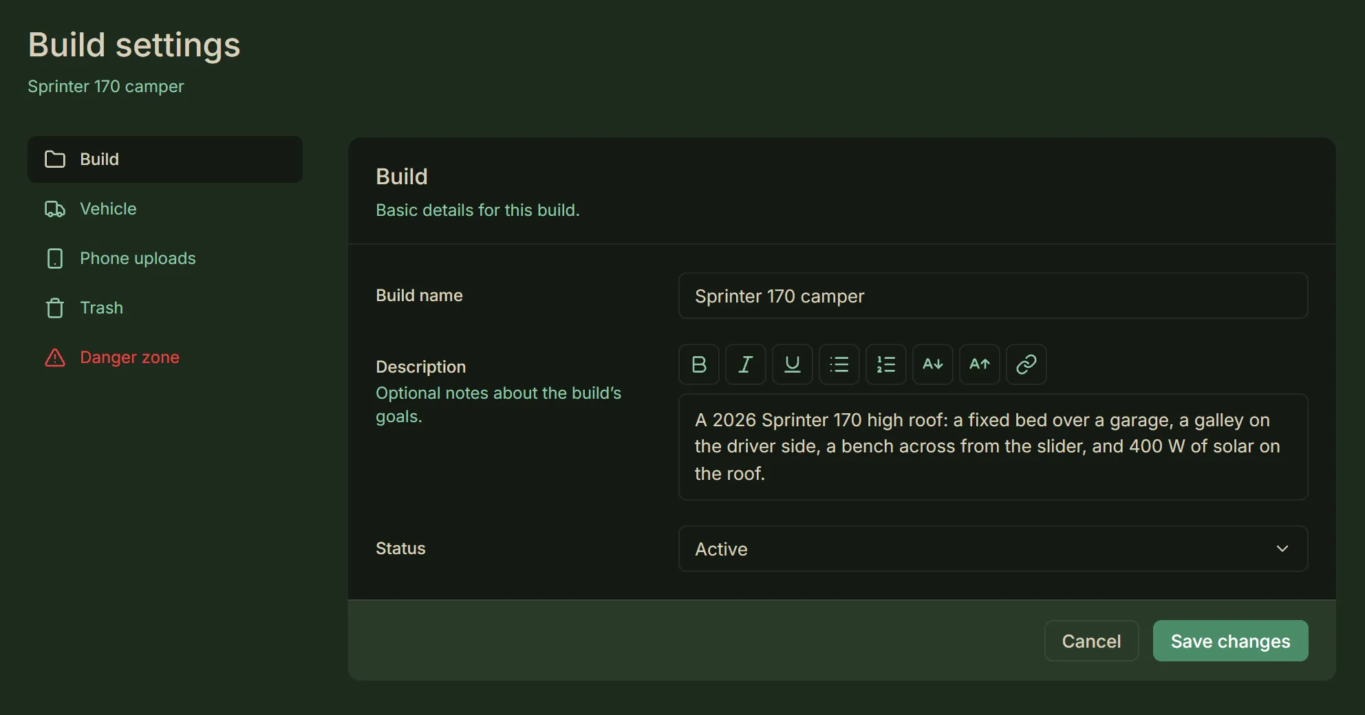
Build settings, open on Build. - Vehicle
Your van’s make and model, interior size, weights, wheel wells, doors, build layers and photos.
- Build layers
On the Vehicle section’s Build layers tab, give the floor, each wall and the ceiling its layers, from the metal inward. Each layer has a thickness and, for insulation, its material.
- They take room — the layers come off where components can go, and off what you measure to a wall, the floor or the ceiling. Once the van’s interior size is entered, they come off the cargo volume too.
- Drawn in 3D — the layers are drawn inside the van, and the insulated ones give the R-value estimate in the Heating module.
- A pop-out’s own — set on the pop-out itself, on the Specs tab of its component form.
- Phone uploads
On Builder, send photos from your phone to this build.
- Show QR code — shows a code that works for 1 hour. Scan it to open a page on your phone that needs no sign-in, then take a photo or choose photos there.
- New code — makes a fresh code and switches the old one off.
- The inbox — keeps each photo for 30 days, holds up to 50, and lists new ones every 5 seconds while it is on screen.
- Van photos — From phone uploads sits beneath the van photos’ Add photo.
- Product image — From phone uploads sits beside a component’s or wishlist item’s product image.
- Install photos — From phone uploads sits beside a component’s install photos.
- Receipts — From phone uploads sits beside a receipt. That covers one attached as you add a component or a budget item, and one attached later from its Budget line.
- What it opens — From phone uploads opens the QR code above the inbox, and attaches a photo you pick there. The photo is copied in, and leaves the inbox once you save.
- Beside a product image — it takes one photo, replacing any image there.
- Toolbar
Bottom left, in six groups: the tools, Undo, zoom and reset, the views, Dimensions and the camera-controls hint.
- The tools — Select, Move, Rotate, Measure and Zones. While Rotate is on, pick how far it snaps: 15°, 45° or 90°.
- Where it lands — in Move, a free-placed component set to rest on surfaces falls, when you let go, onto the first thing below it. That can be the floor, a wheel well or the top of another component, one mounted on a wall or the floor included. It never climbs onto a component above it.
- Stacking — use the Selection panel’s stacking buttons. Or raise it above the other component with Shift-drag and then move it, and it falls onto that component.
- Into a pop-out — the part reaching into a pop-out on a side or the front wall lands on the pop-out’s floor, or on anything higher beneath it.
- Undo — does what Ctrl+Z does. Its entry under Shortcuts lists what that undoes.
- Zoom and reset — zoom in and out, and reset the view.
- The views — look from the top, the front or at an angle.
- Dimensions — labels the van’s inside width, height and length, its wheel wells and doors, and the selected component’s size.


The toolbar: the tools, Undo, the zoom and view buttons, and Dimensions, then the camera-controls hint. - Layers
Bottom right. The Layers button opens the layers in rows, Van, Components and Overlays, with the floor grid below them. The button says how many are off: Layers · 4 off.
- Turning one off — fades what is on it, so you keep your bearings while you look past it. Cutaway is the one you turn on, to take something away.
- Kept per build — the layers and the grid are saved with each build. A build whose layers you have never changed starts from the defaults.
- Cutaway — first in the Van row, starts off. Turn it on to take away the walls and ceiling on the camera’s side of the van, so you can see in. Their build layers and door outlines go with them, and which ones go changes as you orbit. It never takes away the floor or a component, a pop-out included.
- Shell — fades the van’s walls, ceiling and wheel wells, and the pop-outs. The floor, the doors and the zones stay as they are.
- One kind each — nine more fade one kind of component each: eight by system, and Exterior the components mounted on the outside of the van.
- Floor, Walls and Ceiling — show only when your build has build layers there, a pop-out’s own included. Walls covers a pop-out on a side or the front wall, Ceiling a pop-top. Each draws its build layers. Hiding them never changes the room they take.
- Hide, not fade — Floor, Walls, Ceiling, Zones, Rear axle, Clearance and Out of place hide what they draw rather than fading it. All of them but Zones start off, as Cutaway does.
- Zones — draws the zones’ outlines and names.
- Rear axle — draws a line across the floor at the rear axle, when your van’s details say where it is.
- Clearance — draws the outline of each component’s positions. A selected component always shows its own, and a component shown opened always shows where it sits closed.
- Out of place — outlines each component that is out of place. The next entry says which.
- Grid — draws lines across the floor, spaced from the van’s rear-left corner. Choose Off, 6 in, 12 in or 24 in; it starts set to Off.
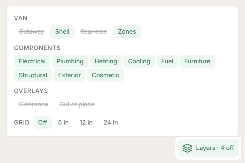
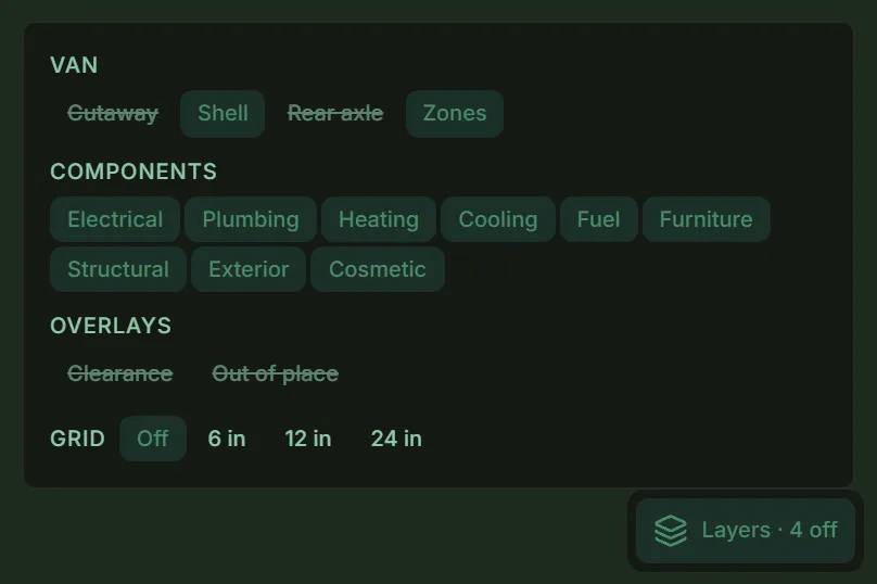
The Layers panel, opened from the Layers button at the bottom right of the 3D view. - Out of place
A layer that starts off. Turn it on to outline each component that is out of place. The Layout panel then offers to move them to the finished floor, walls or ceiling, where a move can. A button for each surface a move can reach, with a count: Set 2 down for the floor, say.
What gets outlined
- Sunk or outside — the component is sunk into the floor’s layers, through a wall’s or the ceiling’s, or partly or wholly outside the van. A change to the layers or the van’s size can leave it there.
- Off its face — a component mounted on the inside of a wall, the floor or the ceiling, or set into its layers, has come off its face. It also counts when sunk into a layer or past a wall along its surface.
- Off the outside — a component mounted on the outside has come off its surface. A component mounted on the outside of the van never shows it while it sits on its surface, however far it overhangs.
- Open state collides — a drawer, door, flap, size change or custom state shown open runs into a layer or through a wall, the floor or the ceiling.
What doesn’t
- Outside, or pushed out — an open state on a component mounted on the outside of the van. The same goes for one set into a surface’s layers and pushed further out through the metal it sits in.
- Through a door — an open state that goes out through one of the van’s doors. The doors count as open, however far it reaches. If any of it goes through the wall beside the door, it is outlined.
Caution — A move button does not fix an open state that collides. Close the component, or move it yourself.
- Layouts
Top right. A layout remembers which components are shown opened: “Travel” with everything closed, say, and “Camp” with the bed down and the drawers out.
- Switching — pick one to switch the whole build at once.
- Plans — Free keeps 1 saved layout beside the base layout; Builder has no limit.
- The figures — a layout changes what is drawn, never the figures, which always count each component closed.
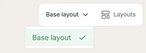
The layout picker, top right, open on the base layout. - Component card
Click a component to open its card. Clicking a component linked into a group selects the whole group and opens no card. Click one of its members again to pick it alone and open its card.
- Key figures — size, weight, zone, and the one its system is about: power, capacity, output, airflow or fuel, or the system itself when it has none. Plus how many components sit inside it.
- State — Planned, Purchased or Installed; click one to switch. Going back to Planned asks first, since it clears the purchase date and sales-tax rate.
- Shown in — when it has positions, which one it is shown in.
- Buttons — Edit, Duplicate, Move, Rotate, Add position and Measure from here.
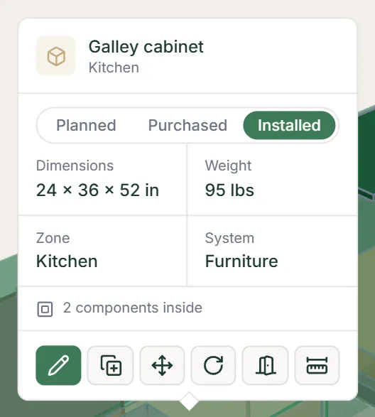
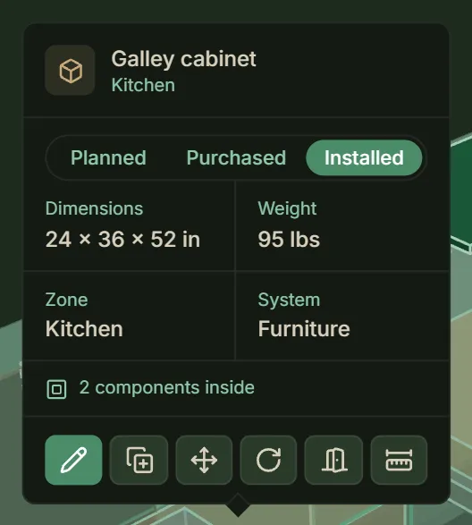
A component’s card: its figures, its state and its six buttons. - Selection panel
Top left, whenever something is selected. Ctrl-click a second component to build a selection, and the panel offers what you can do with it.
- Two or more — Move them together, or Link them into a group that moves as one. Stack them On top of or Below each other, or set them Beside one another.
- Line up — their edges or centres side to side, front to back, or top to bottom, so tops and bottoms line up too. With three or more, Distribute spaces them evenly.
- The anchor — the others line up against it. It has a heavier outline and is tagged anchor in the panel.
- Which is the anchor — in a selection you build by Ctrl-clicking, the first one you picked. Clicking a linked group makes the member you click the anchor. Click another name in the panel to make that one the anchor.
- Surface mounts — components mounted on a surface can be stacked, set side by side and lined up too, along that surface. Two lights on one wall side by side, say, or a window flare level with one on the other wall. A command that would take one off its surface leaves it where it is.
- Dragging a group — moves it along the surface of the member you grab: along its wall, up and down included, for a wall-mounted one. Otherwise, or when you are looking along that wall, as from Top-down, it moves across the van.
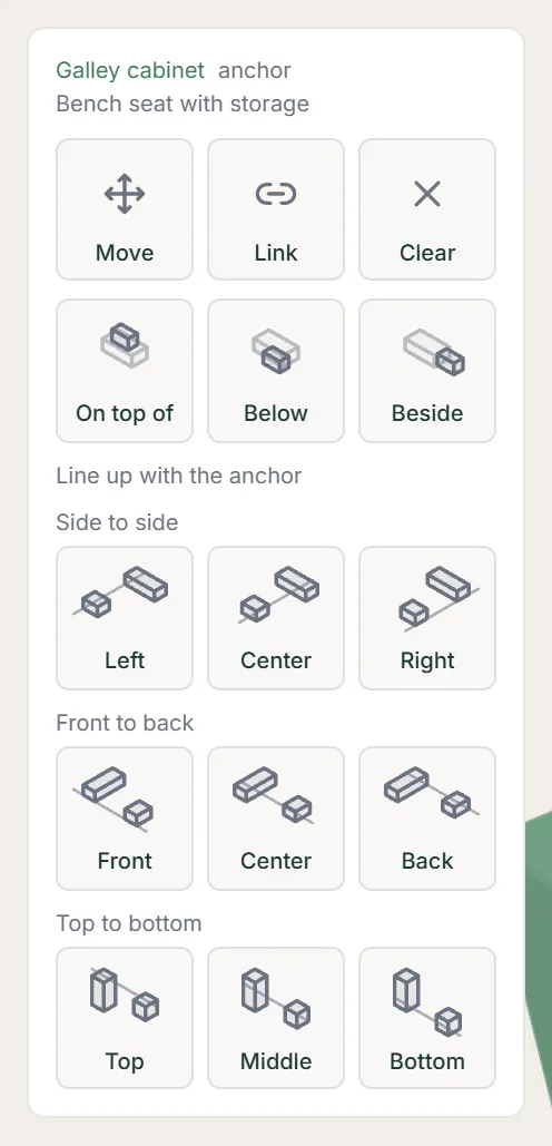
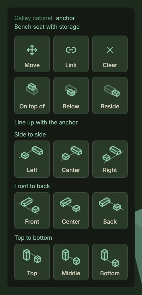
The selection panel for two selected components, with the stacking and align buttons. - Measure
Pick the Measure tool, click a component, a wall, the floor or the ceiling, then click another, and read the clear gap between them. Click inside a pop-out to measure to its floor, ceiling, sides or far face.
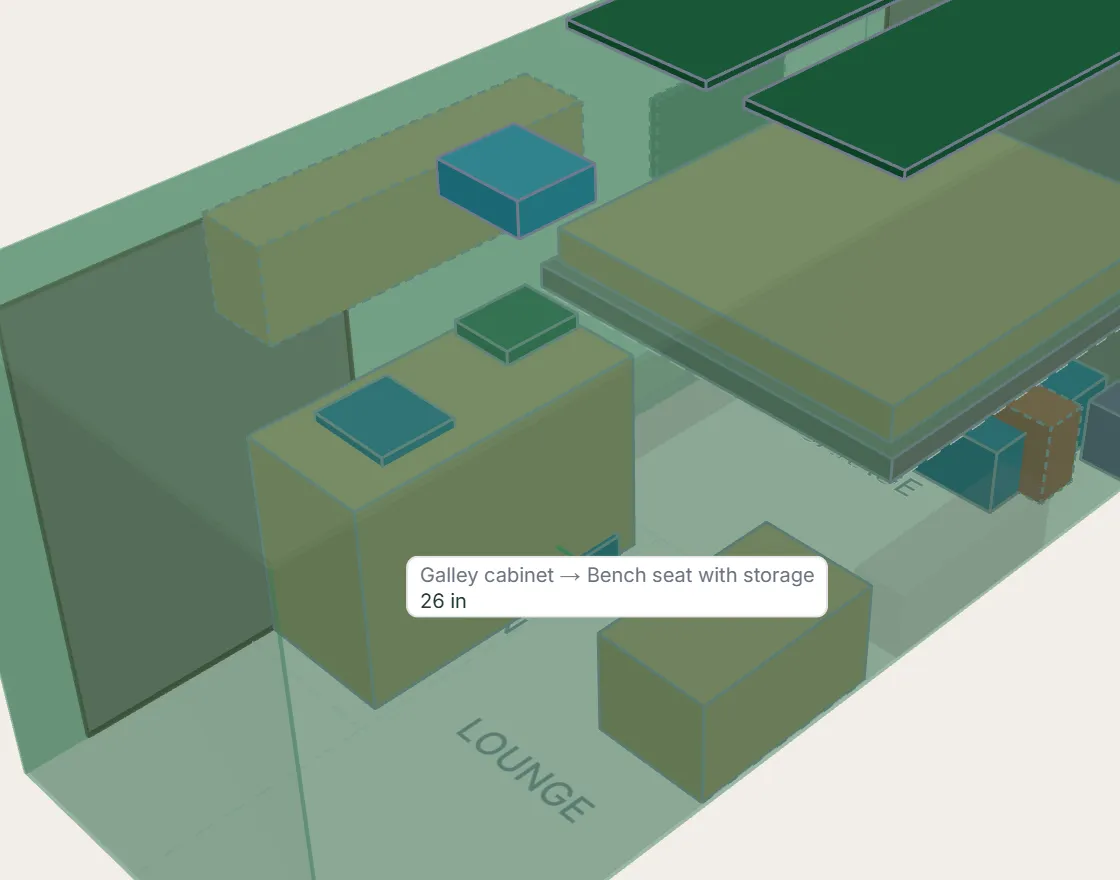
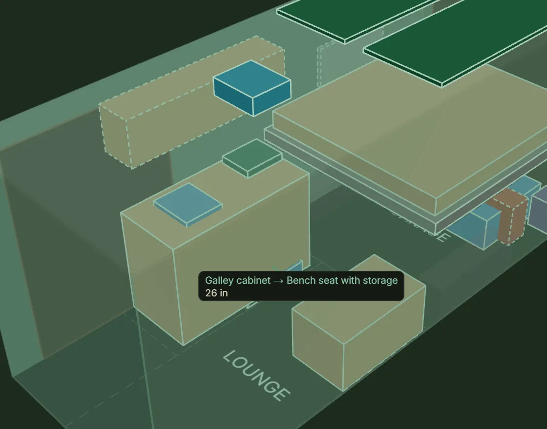
The Measure tool reading the clear gap between two components. - Positions
Add position, on a component’s card, opens the positions tool, where you set a position on the component itself: a door that swings open, or a drawer that pulls out.
- Drawer or door — click the side that opens. Then drag it out for a drawer, or click near one of its edges to hinge a door there.
- Shown in — on the card, draws the component opened or closed.
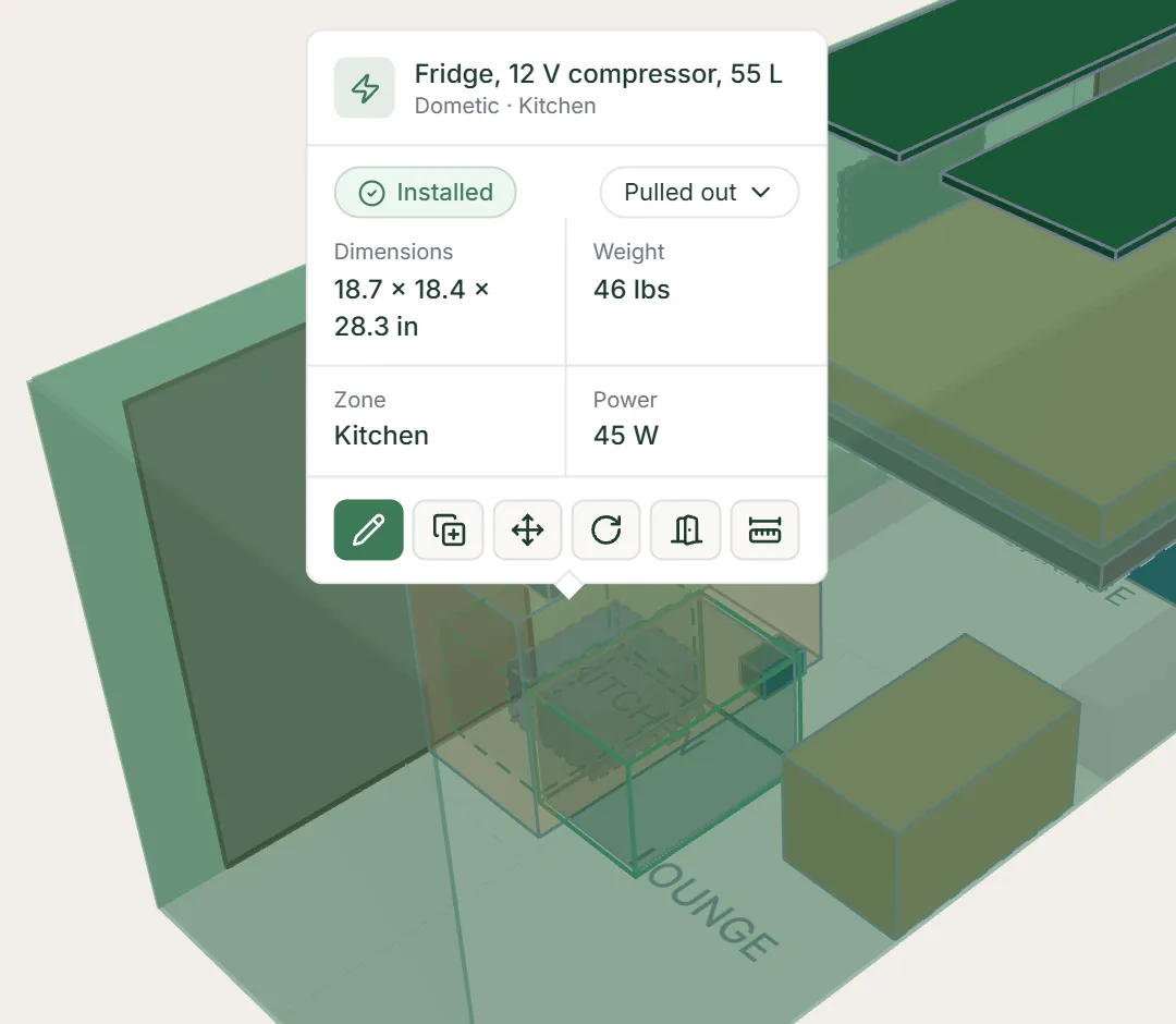
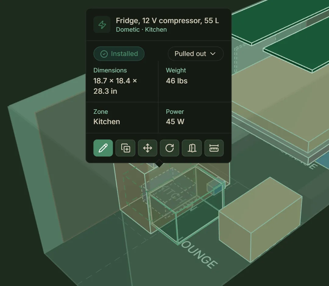
A component shown opened: a fridge pulled out of its cabinet. - Zones
Zones name regions along the van, like Garage or Kitchen. A component can sit in one or in none.
- Width — a zone runs wall to wall unless you narrow it to part of the van’s width.
- Into a pop-out — a raised zone can reach into a window flare, and one inside a pop-top’s opening can rise into it.
- Editing — pick the Zones tool and click a zone. Drag an end to lengthen or shorten it, a side to narrow or widen it, or the middle to move it. Hold Shift while you drag to raise or lower it.
- The card — top left, shows the zone’s name and exact numbers, with Add zone and Delete zone.
- Width fields — Across from and Across to set the width, measured from the passenger-side wall. A blank one means that wall.
- Below 0 — Across from below 0 reaches into a flare on the passenger side.
- Van size — changing the van’s size never moves your zones.
- Without a van — a build without its van added shows the starting zones, but you can’t edit them until you add it.
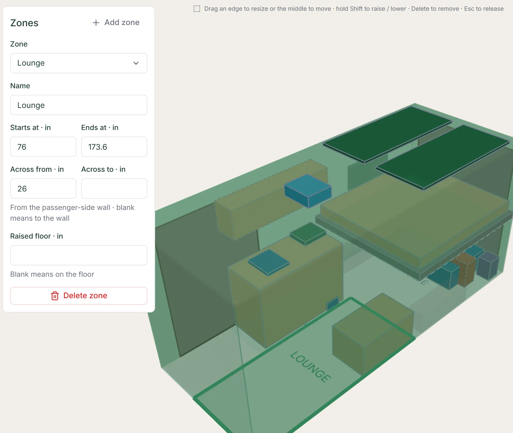
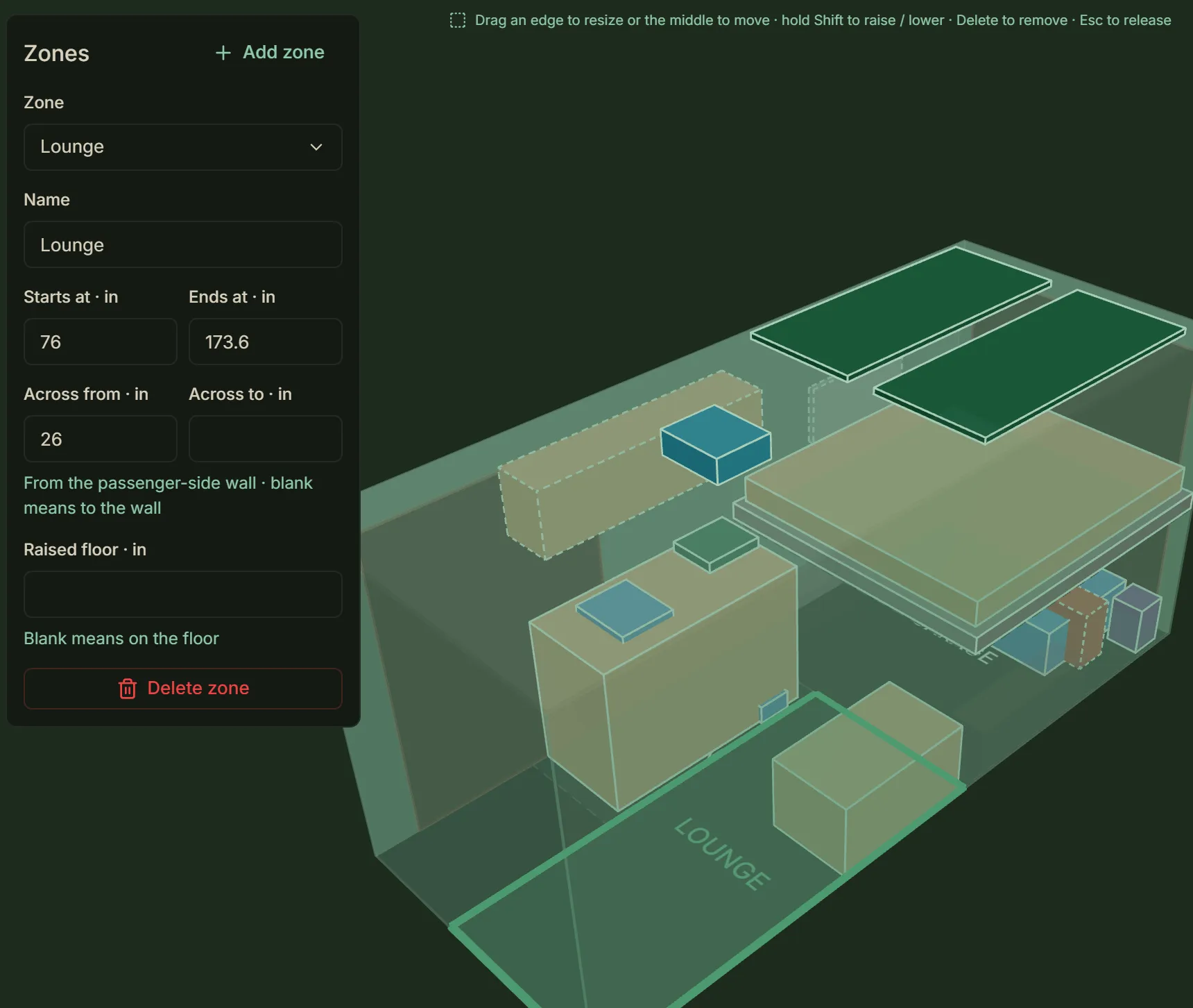
The Zones tool, with a zone picked and its card at the top left.
Press Add in the rail, from any module. The same form fills itself in from a product page or takes what you type.
- From a product page
Paste the product’s web address and press AI autofill. It reads the page and fills in what it finds. Anything it could not find is highlighted for you to fill in. It also suggests where a product fixed in place mounts — on the roof, the ceiling, a wall or under the floor — for you to check.
- The product — its name, brand and model.
- The figures — its size, weight and price.
- Its specs — power, capacity, output and the other specs its type calls for.
- An image — a product image.
- A description — a short description of what it is.
- Its type — if you leave the type on Auto-detect; or pick one yourself.
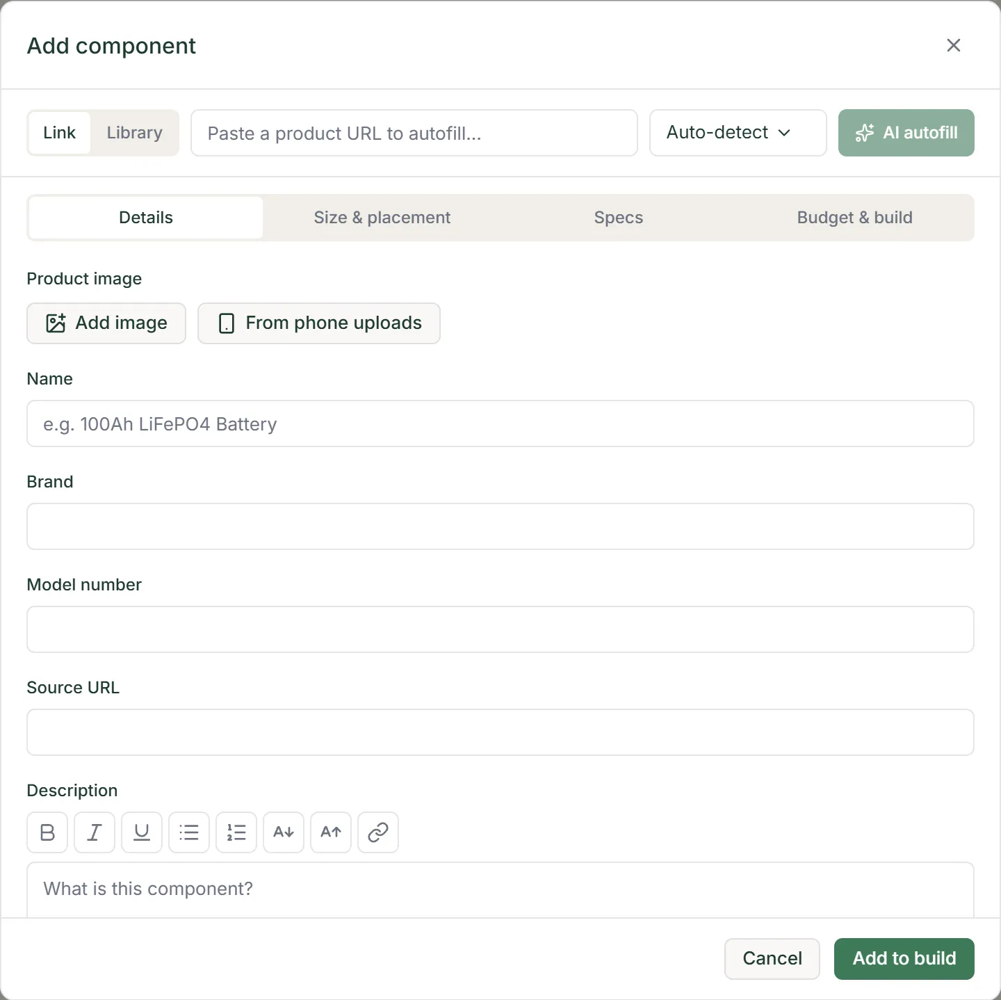
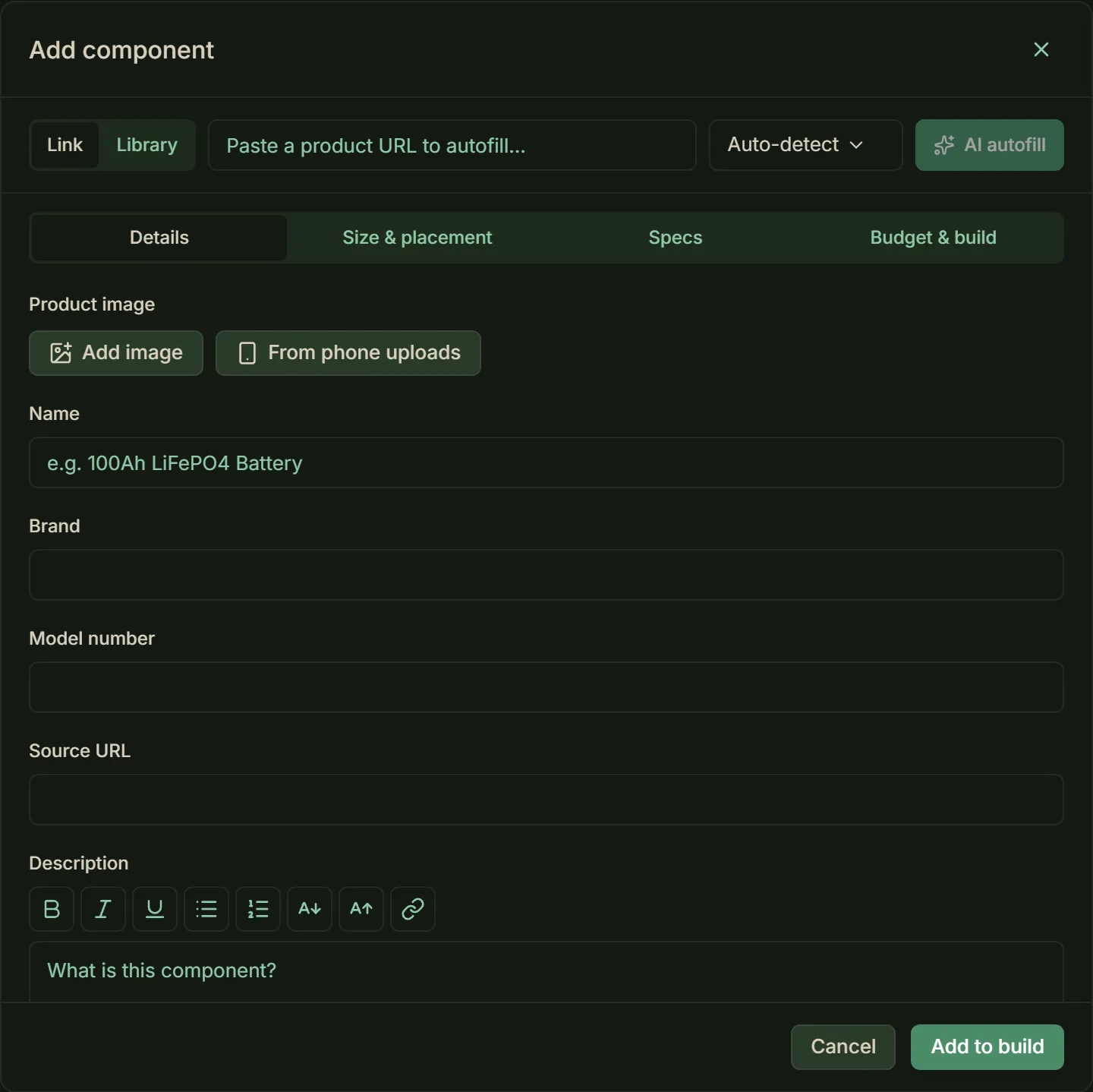
The Add component form, on its Details tab. - Extractions
Each page it reads uses one extraction from your plan. On Builder, once the month's are used, it draws on prepaid extractions you can buy in Settings → Plan.
- By hand
Every field can be typed. The form’s tabs are Details, Size & placement, Specs and Budget & build.
- Details — Model number and Source URL follow the name and brand.
- Specs — choose the System type. A type you picked in place of Auto-detect fills it in, and a pop-out mount is always Structural. Otherwise a component you type in has none, and is not added until it has one.
- Budget & build — a component starts Purchased, dated today, because a part you have not bought yet belongs on the wishlist. Untick it if you have not.
- Also there — Installed, Came with the vehicle and Install notes, and, on Builder, install photos and a receipt.
- Formatting — the description and the install notes take bold, italic, lists, links and two text sizes.
- From your phone — on Builder, From phone uploads adds photos you sent from your phone, beside the product image, the install photos and the receipt. See Phone uploads, under Build settings.
Tip — A failed autofill never stops you adding the component.
- From your library
On Builder, Save to library in a component’s edit form keeps its details, positions and image in your account. From there it fills in the form in any build, with no extraction.
- Picking one — choose Library at the left of the form’s top row, where Link shows the product URL. Type to narrow the list by name, brand or model number, then pick the entry.
- When it shows — Library shows once your library has an entry, or with a note if your library didn’t load. It does not show when the form opens from a wishlist item’s Add to build.
- Adding by hand — without a build, choose Add component on the dashboard’s Component library tab. Paste a product URL and choose AI autofill to fill in the form, which uses one extraction, or type the details in. Adding needs Builder.
- Editing or deleting — open the entry’s card on the dashboard’s Component library tab. Editing needs Builder.
- Builds already using it — an edit never changes a build that already used the entry, which keeps its own copy.
- Other ways in
Two more buttons add a component.
- Add to build — on a wishlist item, opens the same form with the item’s details filled in.
- Duplicate — on a component’s card, adds a copy a few inches away. The copy keeps everything it holds: bought or not, installed or not, its date, notes, photos and receipt.
- Free placement
Puts the component in the middle of its zone, or of the van when it has none, on the floor. Moved, it stays inside the van and out of its walls, floor and ceiling. The one exception is where it reaches into a pop-out.
- Into a pop-out — it can reach in through the opening, as long as the part past the wall or roof fits inside the pop-out. That part counts as space used inside the van.
- Two at once — one across the van can reach into a pair of side-wall pop-outs at once, like a bed across two window flares.
Note — Move or delete the pop-out and the component stays where it is, marked out of place.
- On a wall, the floor or the ceiling
A wall, ceiling or floor mount, inside, set into the layers or outside, puts it in the middle of that surface.
- Inside — moved, one mounted inside stays inside the van and out of its walls, floor and ceiling.
- Outside — one mounted outside may hang past its surface. Give anything meant to sit outside the van, like a roof box or a rack, an outside mount.
- Set into the layers
A mount set into a surface’s layers sits in them. It slides along its surface inside the van and out of its walls, floor and ceiling, like one mounted inside.
- Flush with the metal — like a window frame: its outer face lines up with the van’s metal, and it reaches through the layers into the van.
- Flush with the finish — like a puck light: its inner face lines up with the finished wall, floor or ceiling, and it sinks into the layers.
- What counts — only the part that sticks out of the layers counts as space used. If one flush with the finished surface sinks past the metal into a pop-out, the part inside the pop-out counts too.
- Pop-outs
A pop-out mount, on a side wall, the roof or the front wall, is for room added past the shell. A window flare, a pop-top roof or a shelf over the cab seats, say. It sits past the surface like an outside mount, and its size is added to the van’s interior cargo capacity.
- A pop-top — give it the size it has when raised.
- The front wall — a front-wall pop-out is for room forward of the cab bulkhead, so give the van’s interior length to the bulkhead.
- Its type and seat — a pop-out is always Structural, and it sits on its wall or roof. It cannot hang past the surface it is on. Once the van’s interior size is entered, it cannot be larger than that surface.
- Drawn open — the wall, roof or front wall is drawn open across a pop-out, with its build layers cut away there. The pop-out is drawn see-through in the walls’ colour, open on the van side, so you can see the room it adds.
- Its own layers — give a pop-out layers on the Specs tab of its component form, for its outer wall (its top, on a pop-top) and its sides. They take room from what it adds, and a component reaching into it stops at their faces.
- The van’s layers — the van’s own layers then stop at the pop-out’s layers, and the space they leave across the opening counts as space used.
- On a pop-out
A wall or roof mount over a pop-out’s opening sits on the pop-out instead. A solar panel on a pop-top’s lid, say, or a light on a window flare’s inner wall.
- Moving it off — move it off the pop-out and it drops back onto the van’s wall or roof.
- Moving the pop-out — its mounts stay where they are, marked out of place. A Layout panel button then puts each one flush with what is under it now. That is the pop-out where it is still over it, otherwise the van’s wall or roof.
The rail’s modules, in rail order. Their figures are worked out from your components and your van’s details, so they change as those do. They are estimates to plan with.
- Tasks
Your build comes with a task list in build order. It is only a starting point: you can edit any task, or delete it if it does not suit your build. On Free, only the planning, design and prep tasks can be changed.
- Two views — show the list as a Checklist or as a Kanban board.
- Opening a task — its dates, subtasks, notes, links and prerequisites.
- Your own — on Builder, add your own tasks.
- Where — new tasks go in the box at the foot of the Tasks panel.
- Order — on Builder, drag a task by its handle, or press Alt+↑ or ↓ on it, to move it up or down the list.
- Prerequisites — a task whose prerequisites are unfinished cannot be marked done.
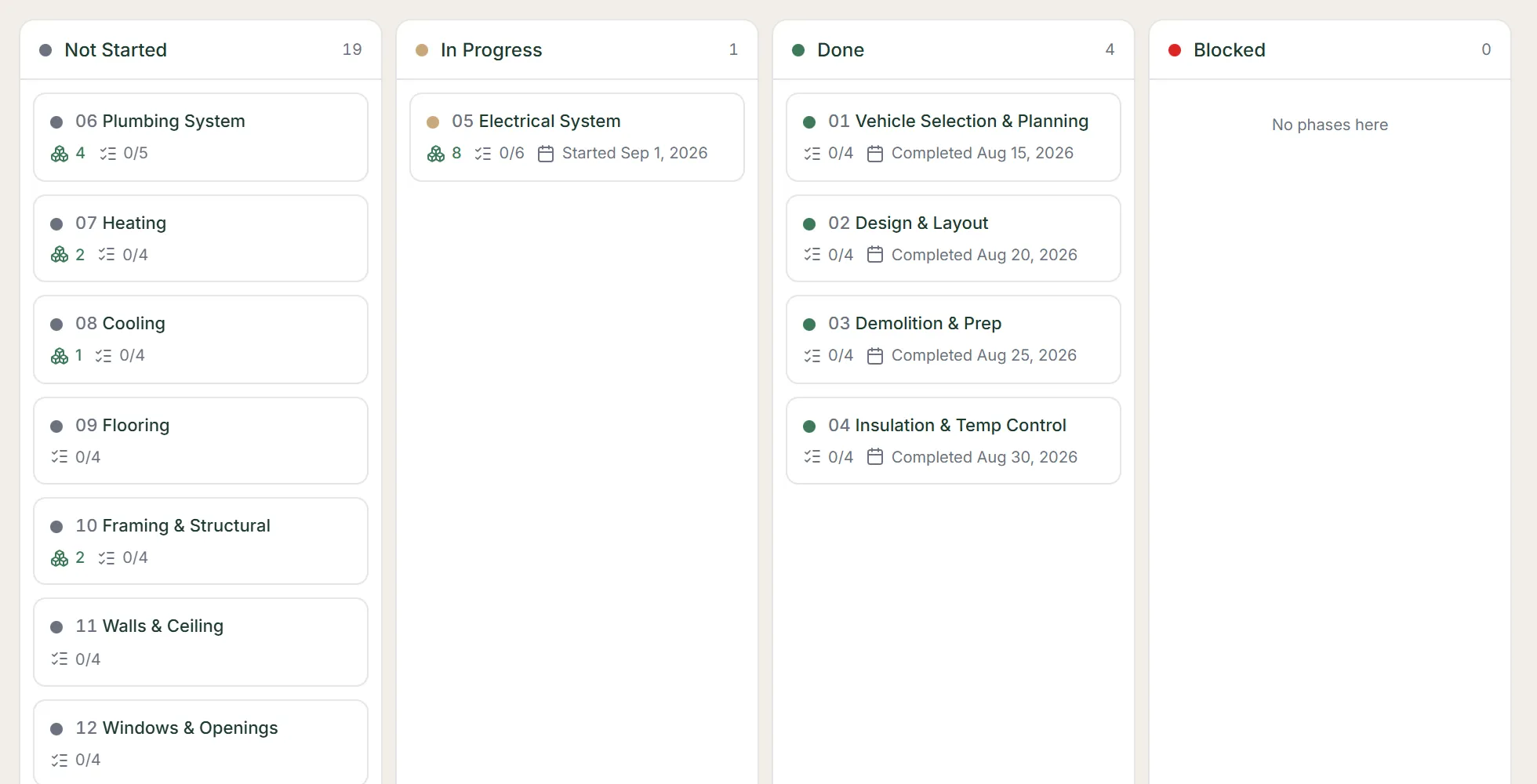
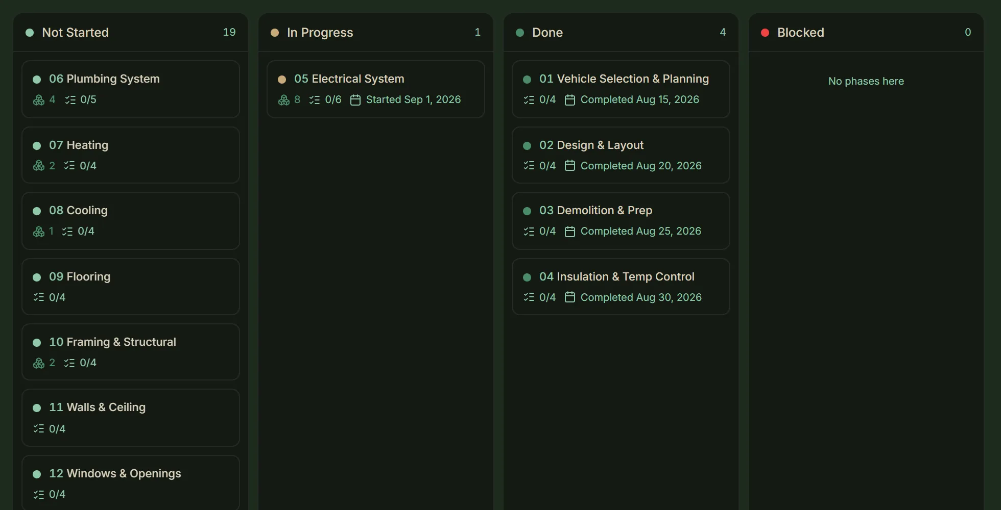
The Tasks module as a board, its tasks in columns by status. - Budget
Spent, to buy, your target and what remains. Spend is split into categories you name, each with an optional target.
- What counts — a component’s price is its cost here, and budget items cover everything else: labour, tools and fees.
- Sales tax — each price can add your build’s sales-tax rate, which you set from the Budget panel. A bought item keeps the rate it was bought at.
- Installed — marks the component Purchased too, and unticking Purchased unticks Installed, unless it came with the vehicle.
- Receipts — on Builder, attach a receipt to any line, or to a budget item as you add it.
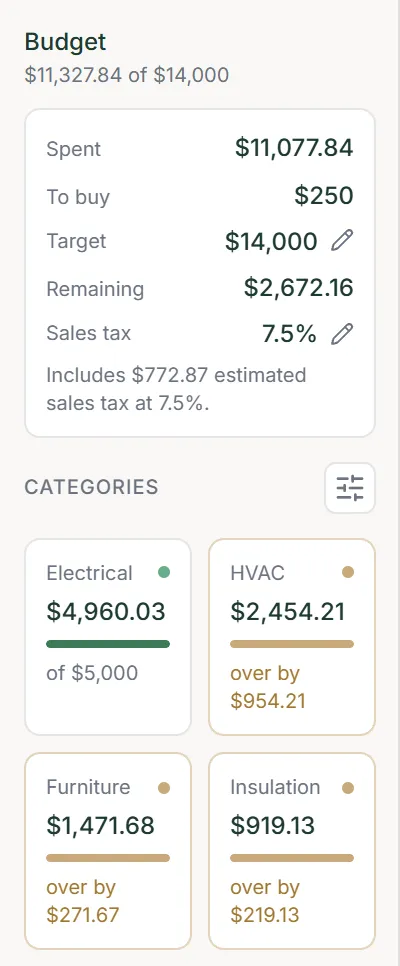
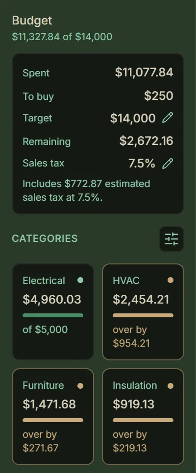
The Budget panel: the totals, then the categories. - Wishlist
Components you are still researching. Autofill them from a product page, compare two or more side by side, and add the one you choose to the build.
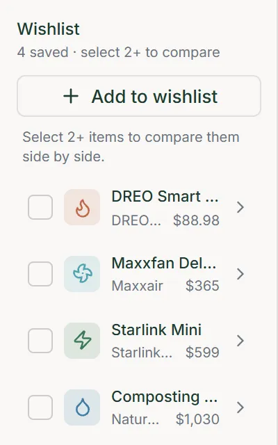
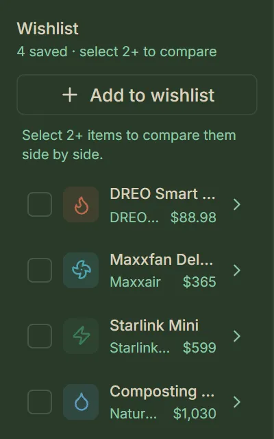
The Wishlist panel, listing the components under research. - Journal
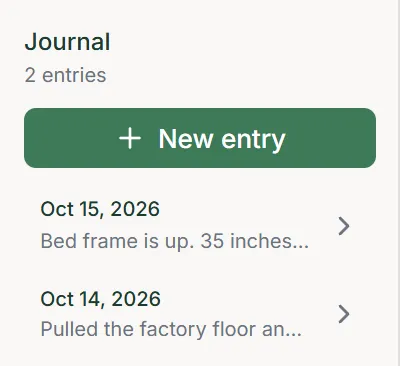
A dated build log. Write down what you worked on, measured or decided, with formatting if you like.
The Journal panel, its entries by date. - Reports
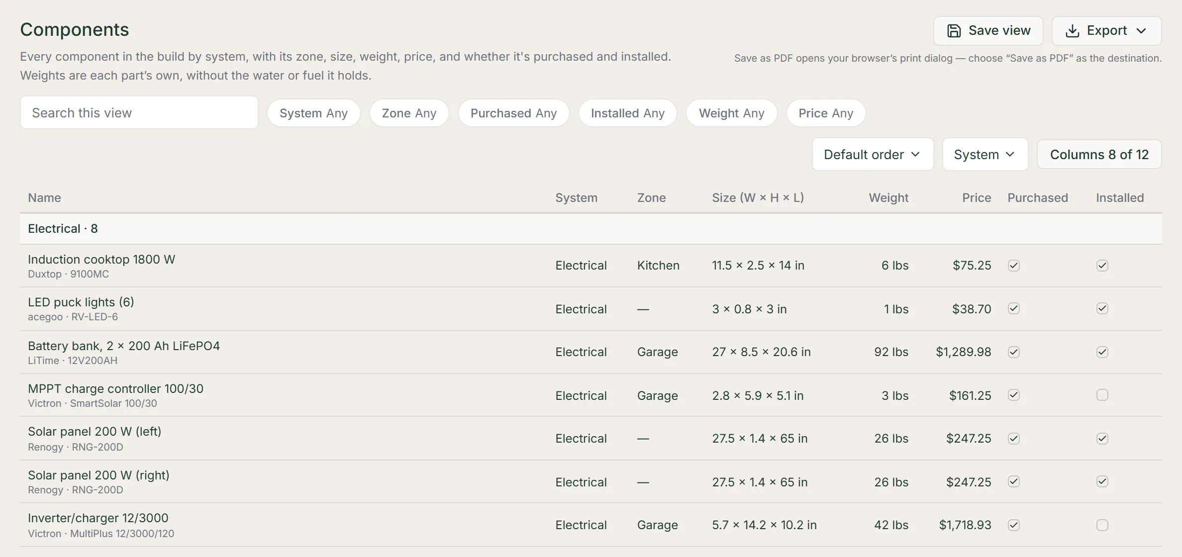
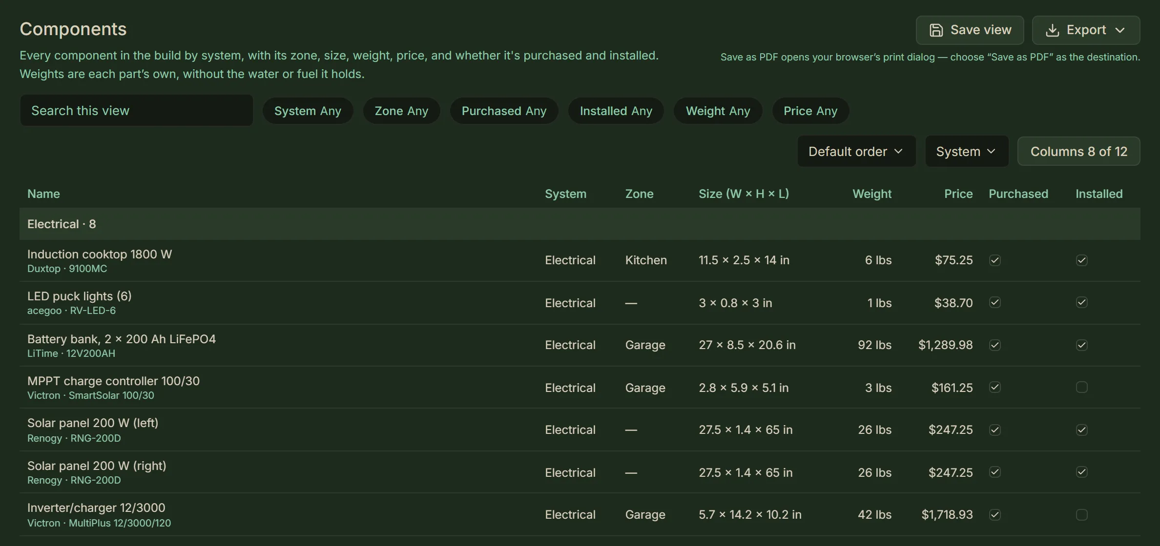
Your build as tables: the components, the wishlist, the tasks and the budget, each one a report.
- Shaping a report — search, filter, sort and group it, and choose and order its columns.
- Filters — a filter can pick values, or keep a range of dates, prices, amounts or weights.
- Save view — on Builder, keeps a view under a name, listed under Saved views to open in one click.
- Export — on Builder, saves the report as you have it on screen as a PDF, a CSV file or an Excel workbook.
The Reports module, open on the Components report.
- Layout
Every component in the build, and how much of the van’s cargo capacity they take up and how much is left.
- Pop-outs — any pop-outs’ room is added to the capacity.
- Payload — what your components weigh, the water and fuel they hold, and what is left of the van’s payload. Fresh water and a fuel tank you fit count full; grey and black water count empty. A component that came with the van adds none of its own weight or fuel, and fuel in the van’s own tank adds nothing: the van’s curb weight already counts them. Any fresh water a component that came with the van holds still counts.
- Outside and axles — it shows any volume outside the van, and the load on each axle against its rating, water and fuel included.
- Notes — a block whose figure needs explaining has this button, with the explanation.
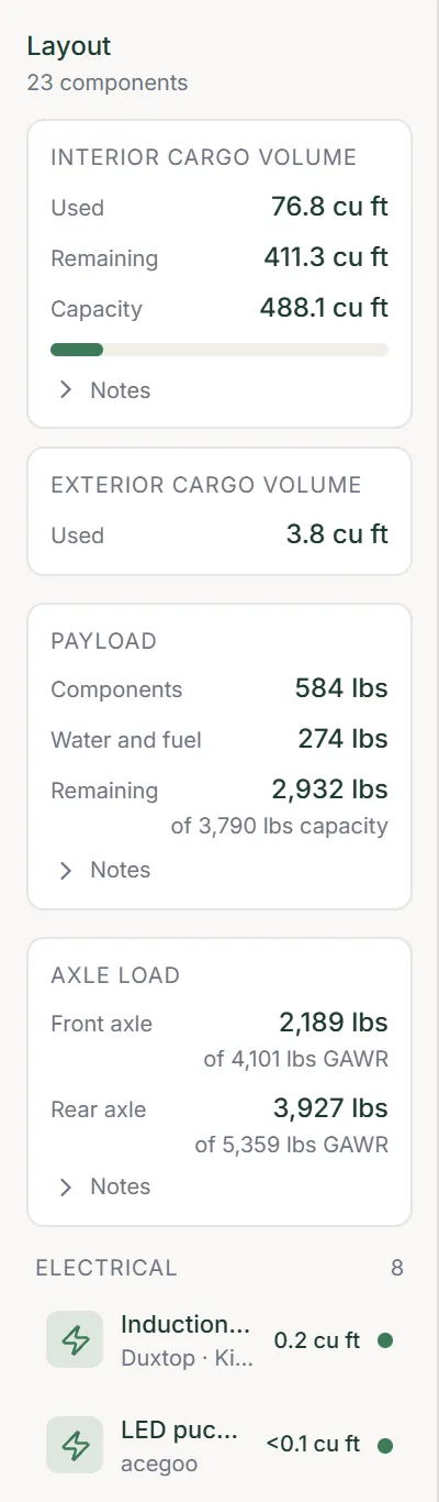
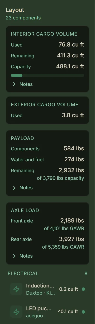
The Layout panel: the two cargo volumes, the payload and the axle loads, then the components. - Power
Your electrical loads and sources, and propane. It adds up the daily load and suggests a battery and solar size to cover it, and shows the battery, solar and inverter you’ve fitted beside what the load calls for. With propane, it shows the tank size, daily use and roughly how long a tank lasts.
- What counts — any component with a power draw is listed here, whatever its type: a roof fan, a water pump or an electric water heater. Give it its run hours to add it to the daily load.
- What you’ve fitted — give a battery its capacity and chemistry, a solar panel its rated output and an inverter its continuous rating, and the panel shows each beside what the build calls for.
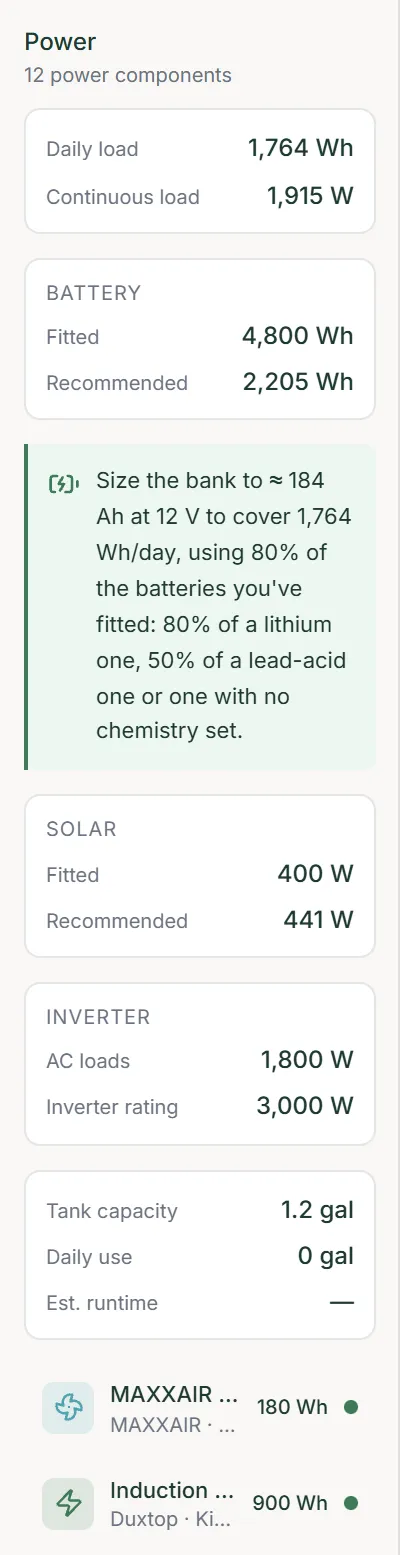
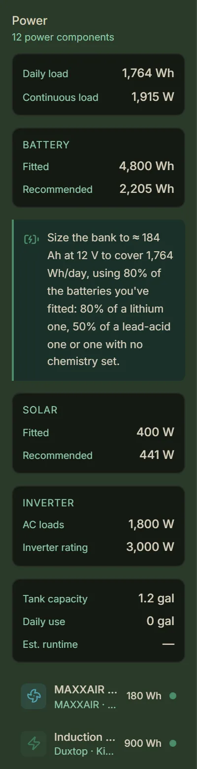
The Power panel: the daily load, then the battery, solar and inverter comparisons and the propane tank, then the components. - Water
Your tanks and plumbing. It totals fresh and grey water, and warns when your grey-water capacity is small next to your fresh water: under three quarters of it. With a shower aboard, nearly all your fresh water ends up in the grey tank, so plan on a grey tank close to the fresh tank’s size.
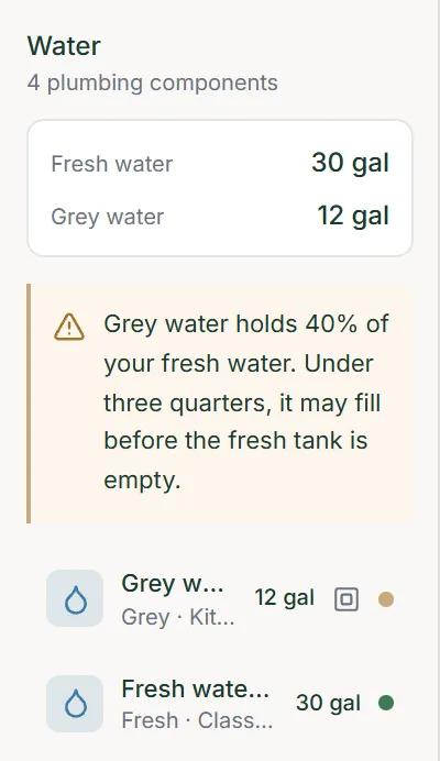
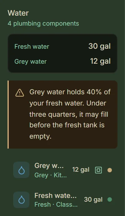
The Water panel: the water totals and their warning, then the components. - Heating
Your heaters’ total output, and an estimated insulation R-value for the floor, each wall and the ceiling. The R-value comes from the insulated layers you enter on the Build layers tab in Build settings.
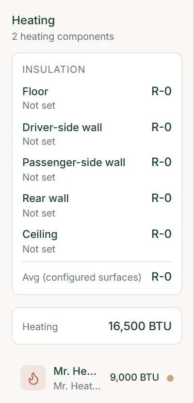
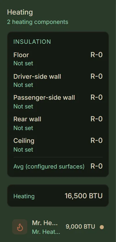
The Heating panel: the R-value of each surface and the total output, then the heaters.
Signing in, your builds, the two plans, your settings, and the emails we send. Prices are on the pricing page.
- Signing in
Sign up with an email address and a password, or with Google or Discord. An account made with an email address confirms it by a link we send. Google or Discord creates the account on the first sign-in. Either way, by continuing you agree to the Terms.
- Two ways — sign in with your password, or press Continue with email link for a one-time link sent to your address.
- Keep me signed in on this device — stays signed in between visits. Untick it on a shared computer, and you are signed out when you close the browser.
- Before your first build — a one-time notice says what the app’s checks are: a planning aid built on your specs and estimates, not a certified inspection. Treat every result as a prompt to verify with a qualified professional.
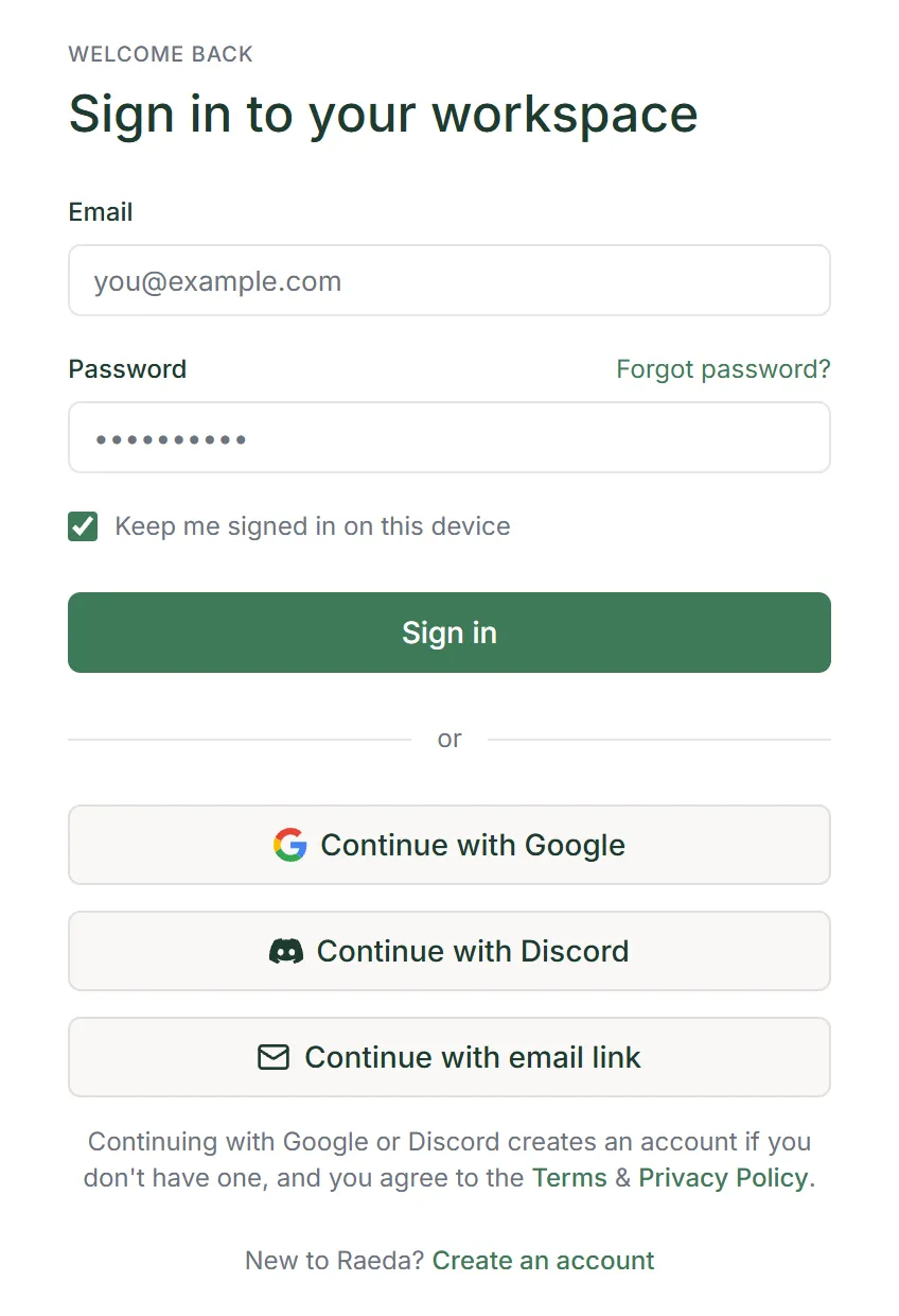
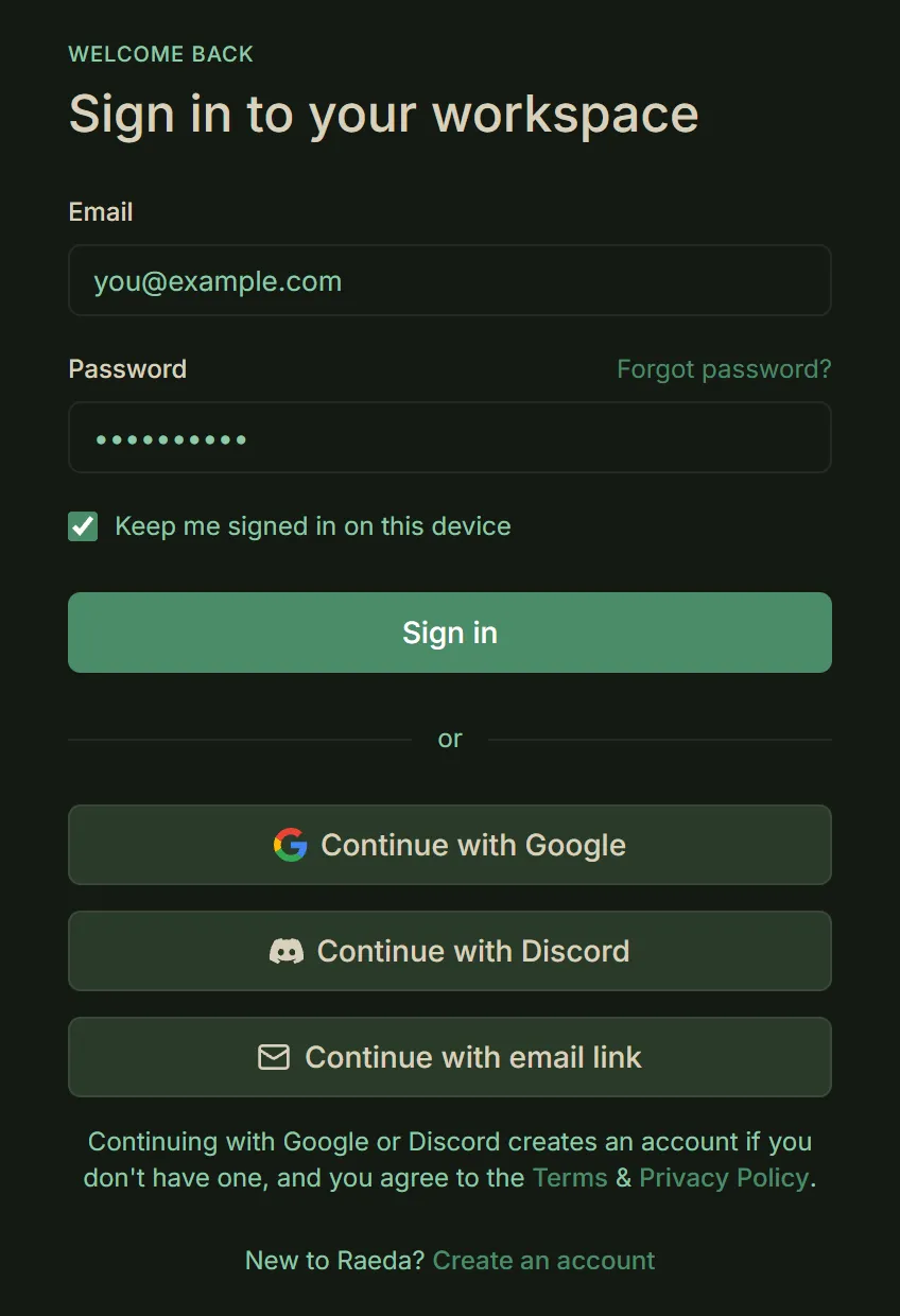
The sign-in page, with Continue with email link under the Google and Discord buttons. - Your builds
The dashboard lists your builds as cards or a list, with a search and a filter by status.
- New build — starts a new one from a van’s web page, the van catalogue, or your own numbers, then opens it.
- Component library — on Builder, this tab holds the components you have saved. It has a search by name, brand or model number, chips to filter them by type, and Add component to add one by hand.
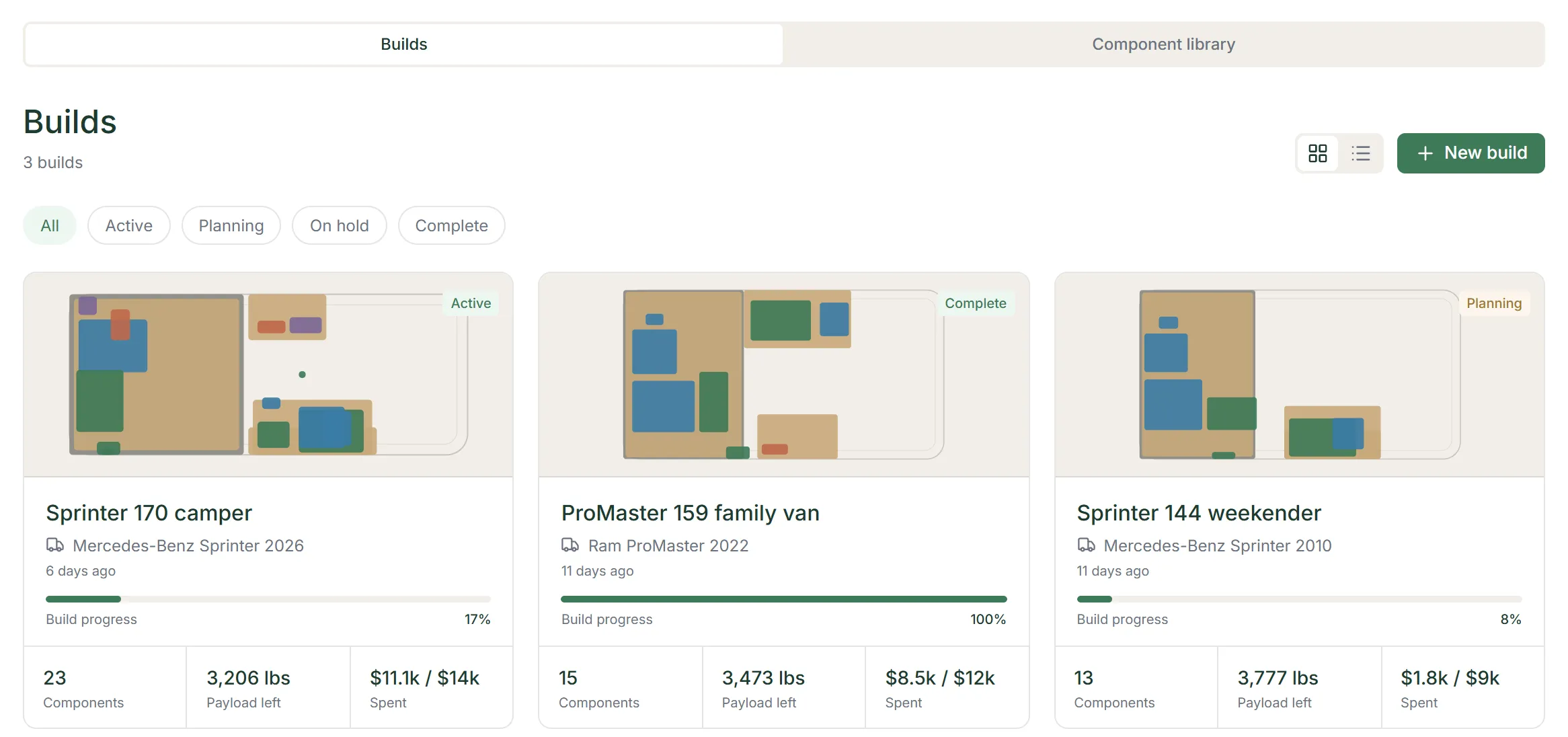
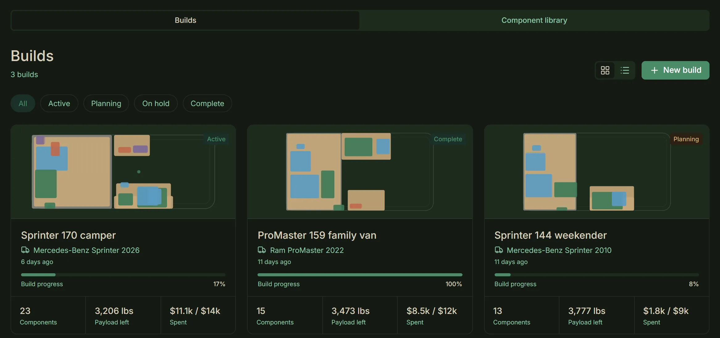
The dashboard’s Builds tab, a card per build. - Free and Builder
Every account starts on Free. Builder lifts every limit and adds the rest.
- Free’s caps — Free keeps 1 build, and in it 10 components, 5 budget items, 5 wishlist items and 5 journal entries.
- Also on Free — 5 extractions in all, and 1 named layout. Only the tasks of the first 3 build phases (planning, design and prep) can be changed.
- Builder — no caps, and 100 extractions a month with prepaid packs beyond them. It adds install photos, van photos and receipts, phone uploads, report exports and saved views, the full task list, and the component library.
- Plan — this Settings section shows your plan and, on Free, how much of each limit you have used. It is where you upgrade, buy extractions and manage billing.
- When Builder ends — the build listed first on your dashboard stays open and the rest are locked, with nothing deleted. Subscribe again and they open as you left them.
Caution — The Free caps count everything the build has ever added, so deleting one frees nothing.
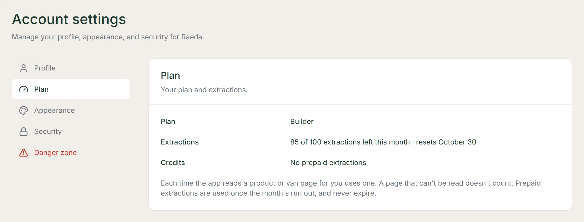
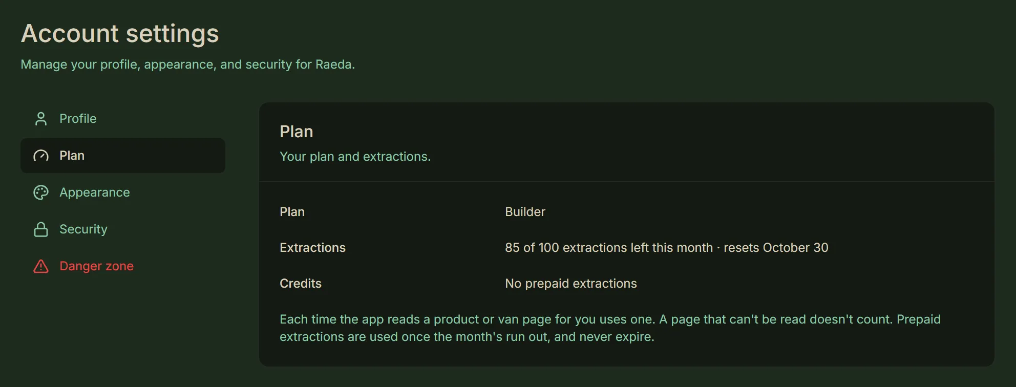
The Plan panel in Settings, on a Builder account. - Settings
Your account menu, at the right of the top bar, opens Settings. Its Contact opens the contact page, and Sign out signs you out.
Section What it holds Profile Your display name and your email address. Changing the address away from the one a Google or Discord login uses removes that login. Plan Your plan and billing, described under Free and Builder above. Appearance Follow your system’s theme with System, or choose Light or Dark. Security Change your password. An account that signed up with Google or Discord sets one through Forgot password?. Danger zone Delete your account and every build in it. Deleting cancels a Builder subscription at once, with no refund for the rest of the period. Any prepaid extractions are forfeited. 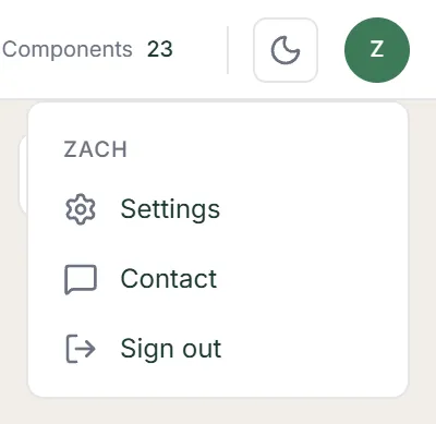
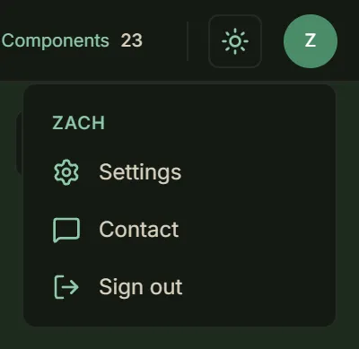
The account menu, under the avatar at the right of the top bar. - Emails
We email you when your account is ready and when it has been deleted. We also write when a Builder plan ends, and when the Terms or the Privacy Policy change.
- Links you ask for — to confirm a signup, to sign in, to reset a password, and, to both addresses, to confirm an email change.
- Addresses — they come from no-reply@raeda.build. Replies and questions go to support@raeda.build.
Every shortcut in the 3D view. While you type in a field, the keys are the field’s. While a dialog is open, only Esc works, closing it. Delete, Space, Ctrl+Z and the arrow keys do nothing while the Tasks Kanban board or the Reports module covers the 3D view. On a Mac, Cmd does what Ctrl does.
- Delete
Asks to confirm, then moves the selected component to the Trash in Build settings, where you can restore it for 7 days.
- When it acts — only when no button or field has keyboard focus. The selected component’s own row in the Layout, Power, Water, Heating or Cooling panel may have it.
- When it doesn’t — while Move or Rotate is on, or while you are in the Measure tool. Backspace does not delete.
- In the positions tool — Delete removes the position you are holding, without asking, and otherwise does nothing.
- In the Zones tool — Delete removes the zone you are holding, without asking, and otherwise does nothing.
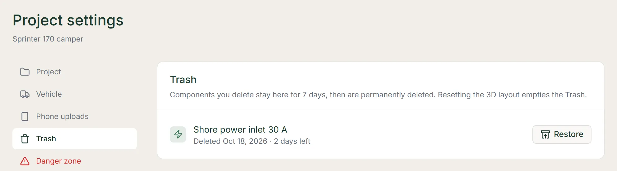
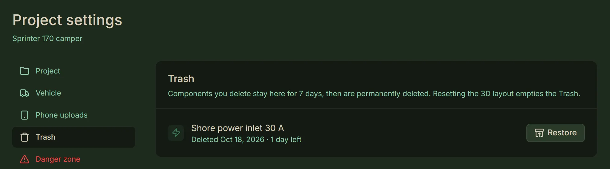
The Trash in Build settings, with a deleted component and its Restore button. - Ctrl+Z
Takes back the last of the changes below. There is no redo.
What it undoes
- Moves — a move, a height change, a rotation, and an align, spacing or placement.
- Finished-surface moves — a move to the finished floor, walls or ceiling.
- Positions — a position set or deleted.
- Switches — a Shown in switch, or a layout switch.
- Zones — a zone edit.
What it doesn’t
- Adding — adding or duplicating a component.
- State and edits — changing a component’s state, or a save in the Edit dialog.
- Deleting — it cannot bring back a deleted component. Restore it from the Trash.
When it works
- Focus — it works even while a button has keyboard focus.
- Not while — Move or Rotate is on, you have a side or a position picked in the positions tool, or you are dragging a zone.
- Space
Resets the camera to the starting view.
- When it works — only when no button or field has keyboard focus. Not while Move or Rotate is on. Nor while you have a side or a position picked in the positions tool, or while you are dragging a zone.
- Esc
Closes the open dialog or card, and cancels a move or rotation.
- Measure and positions tools — it first lets go of what you picked, then leaves the tool.
- Zones — it cancels a drag, then lets go of the zone you are holding, then leaves the tool.
- Arrow keys
In Move, moves the selected component one inch the way the arrow points on screen, landing on whole inches. A group moves the way dragging its anchor would.
- Modifiers — Alt moves a quarter inch, and Shift with ↑ or ↓ raises and lowers a free-placed component or a group.
- Raising — raising a component set to rest on surfaces leaves that setting on, so its next move drops it again. Turn the setting off in its edit form to keep it raised.
- Held keys — a held key slides it. Once you leave Move, Ctrl+Z takes back each press or held slide as one step.
- When they do nothing — outside Move, while you type in a field, or when the focused control uses the arrows itself.
- Click
Selects a component; click empty space to deselect.
- A linked group — clicking a component linked to others selects the whole group. Clicking one of its members again picks that member alone.
- Overlaps — clicking again where components overlap selects the one behind.
- Shift while dragging
In Move, raises and lowers a free-placed component or a group instead of sliding it across the floor or along a wall.
- A Custom position — so does dragging a Custom position’s ghost in the positions tool.
- In Rotate — turns freely instead of snapping.
- A door’s swing — in the positions tool, turns the door in whole degrees.
- Raising — raising a component set to rest on surfaces leaves that setting on, so its next move drops it again. Turn the setting off in its edit form to keep it raised.